Week 3: Sampling distributions
Wed, Feb 14, 2018 Made by Judit Kisistók, incorporating some snippets from Moisés Coll Maciá's solution sheet. The R exercise session was created by Thomas Bataillon and Palle Villesen at Aarhus University.Loading libraries
library(abd) #we need to load the ABD dataset to be able to access the YeastGenes data in Exercise 1
library(cowplot) #this is just for plotting but you don't need to worry about it
Chapter 4, Problem 9
One of the great discoveries of biology is that organisms have a class of genes called “regulatory genes”, whose only job is to regulate the activity of other genes. How many genes does the typical regulatory gene regulate? A study of interaction networks in yeast (S. cerevisiae) came up with the following data for 109 regulatory genes (Guelzim et al. 2002).
Loading the data and taking a peek at the summary:
regulatedGenes=read.csv("chap04q09NumberGenesRegulated.csv")
#read.csv() function - use this whenever you have comma-separated data (aka a csv)
summary(regulatedGenes)
## ngenes
## Min. : 1.000
## 1st Qu.: 2.000
## Median : 6.000
## Mean : 8.312
## 3rd Qu.:12.000
## Max. :37.000What type of graph should be used to display these data?
A histogram:
hist(regulatedGenes$ngenes, breaks=30, col="cornflowerblue",
     xlab="Number of genes regulated", main="Regulatory genes in yeast")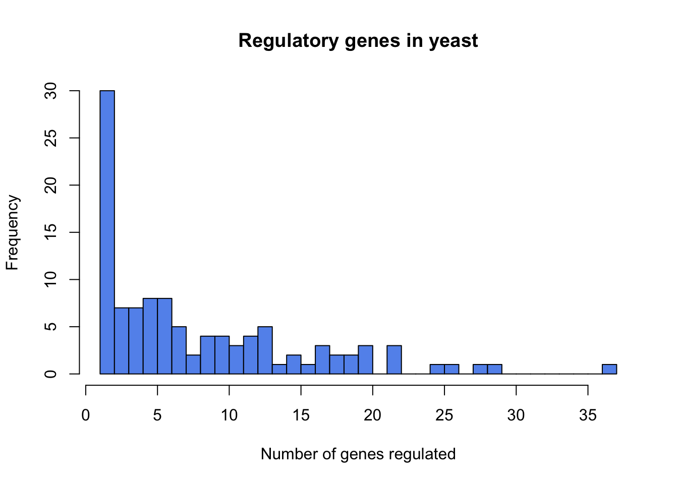
What is the estimated mean number of genes regulated by a regulatory gene in the yeast genome?
mean(regulatedGenes$ngenes)## [1] 8.311927median(regulatedGenes$ngenes) #just for reference## [1] 6What is the standard error of the mean?
sd(regulatedGenes$ngenes)/sqrt(109)## [1] 0.7233423# the standard error is the standard deviation divided by the square root of the sample size and here the sample size is 109Explain what this standard error measures and what assumptions are we making when calculating it.
We assume that:
- the sample is obtained through random sampling
- the statistic is distributed symmetrically
Take me back to the beginning!
1. Reproducing the Figure 4.1-1 & important details of histogram drawing in R
data(HumanGeneLengths) # loading the data of example 4.1 of the book Take a quick peek at the data and try to find the size of the titin gene (hint: footnote on page 97)
summary(HumanGeneLengths)## gene.length
## Min. : 60
## 1st Qu.: 1312
## Median : 2226
## Mean : 2622
## 3rd Qu.: 3444
## Max. :99631Since we know that the longest human gene is the one encoding titin, we can find its length by looking at the Max value in the summary - 99631 nt.
How many genes are in the dataset?
dim(HumanGeneLengths)## [1] 20290 1# this indicates the number of rows and the number of columns in the data - hence, the number of genes (20290) and the number of variables (1 - gene length)Draw a histogram:
hist(HumanGeneLengths$gene.length, breaks=50, col="deeppink4", main="", xlab="Gene length (nt)") 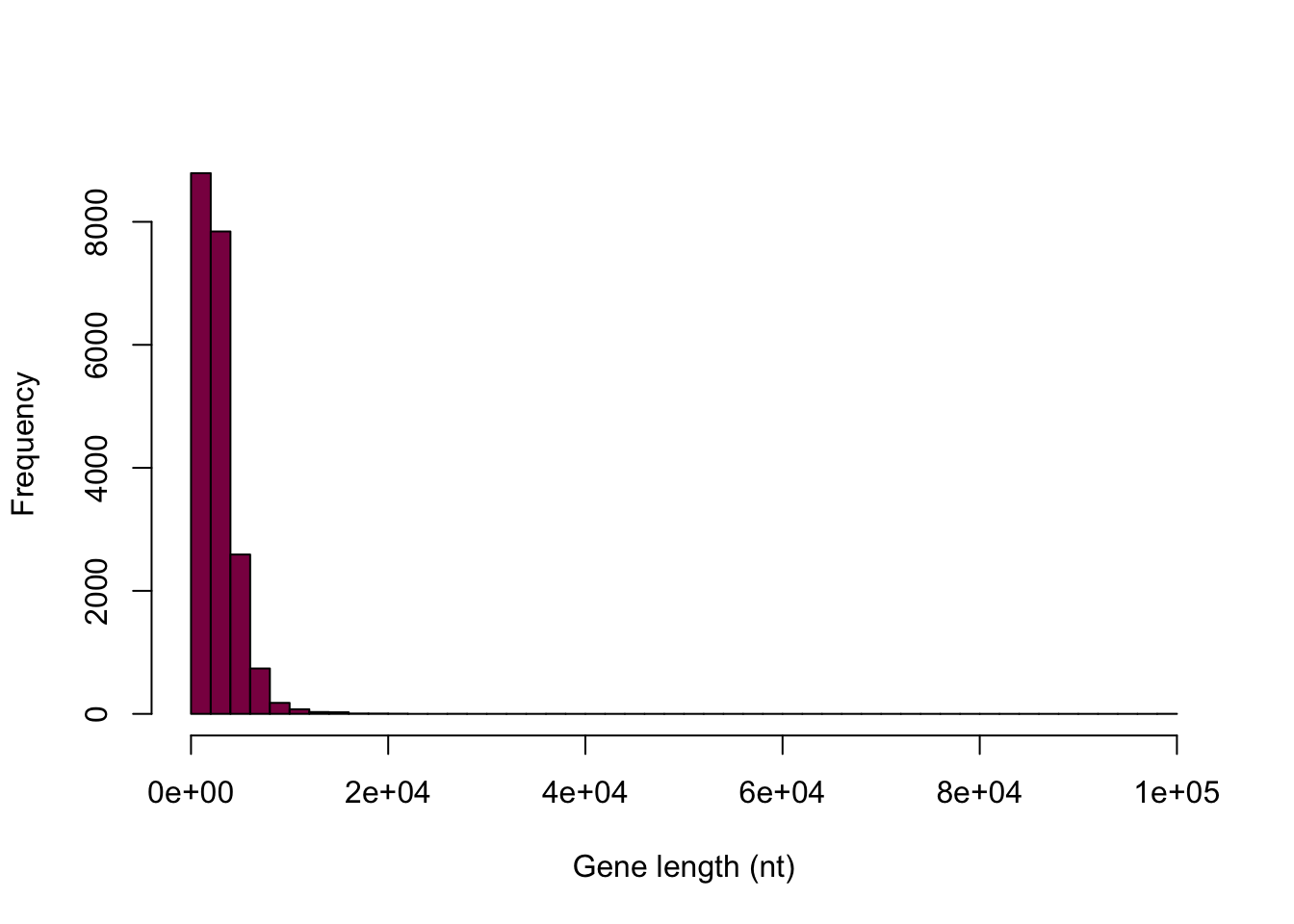
Identify what the options col, main and xlab are allowing you to do.
col: you can add color to your histogram (here is a cool color reference guide if you really want to make it fancy)
main: adds the title to the histogram
xlab: adds the label on the x axis
Why is this graph a BAD display of the data?
Because even though the majority of the data span from 1 to 15000, the histogram above displays the full range up to 10000 - so we get a large empty-looking area. In this case it’s a great idea to say that we want to see a histogram that displays the values between 0 and 15000 - and make a mental note of the “unusual” data point that we disregard in this way.
Are there 50 bins on the following graph? If not, why not?
# we can save the histogram in a variable so that we can gain some information about it later
histdata <- hist(HumanGeneLengths$gene.length, breaks=50, col="deeppink4", main="", xlab="Gene length (nt)",xlim = c(0,15000)) 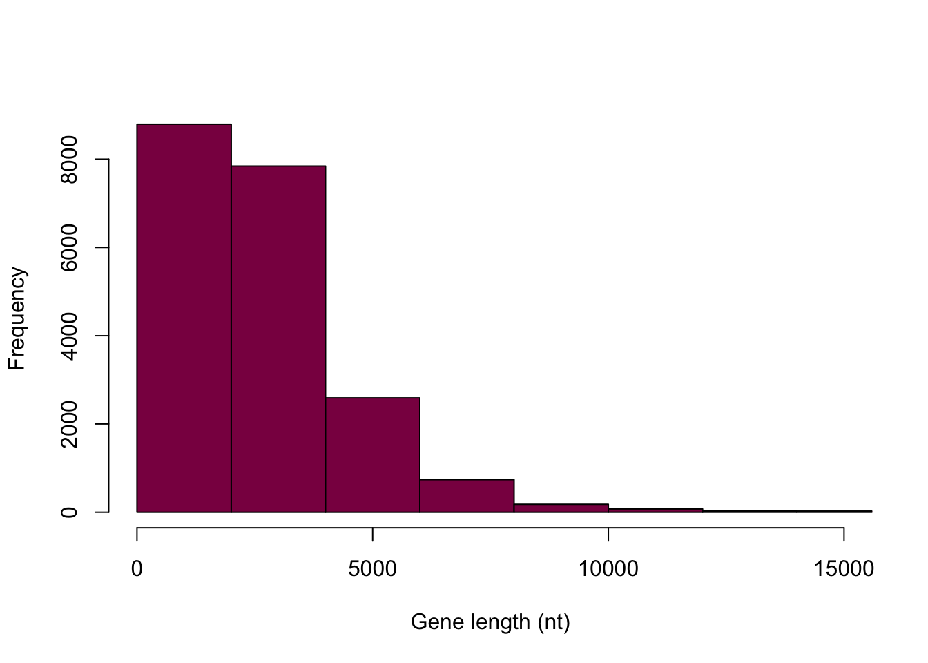
histdata## $breaks
## [1] 0 2000 4000 6000 8000 10000 12000 14000 16000 18000
## [11] 20000 22000 24000 26000 28000 30000 32000 34000 36000 38000
## [21] 40000 42000 44000 46000 48000 50000 52000 54000 56000 58000
## [31] 60000 62000 64000 66000 68000 70000 72000 74000 76000 78000
## [41] 80000 82000 84000 86000 88000 90000 92000 94000 96000 98000
## [51] 100000
##
## $counts
## [1] 8791 7843 2591 738 179 75 30 26 6 5 3 0 0 1
## [15] 0 0 0 0 1 0 0 0 0 0 0 0 0 0
## [29] 0 0 0 0 0 0 0 0 0 0 0 0 0 0
## [43] 0 0 0 0 0 0 0 1
##
## $density
## [1] 2.166338e-04 1.932725e-04 6.384919e-05 1.818630e-05 4.411040e-06
## [6] 1.848201e-06 7.392804e-07 6.407097e-07 1.478561e-07 1.232134e-07
## [11] 7.392804e-08 0.000000e+00 0.000000e+00 2.464268e-08 0.000000e+00
## [16] 0.000000e+00 0.000000e+00 0.000000e+00 2.464268e-08 0.000000e+00
## [21] 0.000000e+00 0.000000e+00 0.000000e+00 0.000000e+00 0.000000e+00
## [26] 0.000000e+00 0.000000e+00 0.000000e+00 0.000000e+00 0.000000e+00
## [31] 0.000000e+00 0.000000e+00 0.000000e+00 0.000000e+00 0.000000e+00
## [36] 0.000000e+00 0.000000e+00 0.000000e+00 0.000000e+00 0.000000e+00
## [41] 0.000000e+00 0.000000e+00 0.000000e+00 0.000000e+00 0.000000e+00
## [46] 0.000000e+00 0.000000e+00 0.000000e+00 0.000000e+00 2.464268e-08
##
## $mids
## [1] 1000 3000 5000 7000 9000 11000 13000 15000 17000 19000 21000
## [12] 23000 25000 27000 29000 31000 33000 35000 37000 39000 41000 43000
## [23] 45000 47000 49000 51000 53000 55000 57000 59000 61000 63000 65000
## [34] 67000 69000 71000 73000 75000 77000 79000 81000 83000 85000 87000
## [45] 89000 91000 93000 95000 97000 99000
##
## $xname
## [1] "HumanGeneLengths$gene.length"
##
## $equidist
## [1] TRUE
##
## attr(,"class")
## [1] "histogram"# this way we can see the bins, the counts in each bin, etc.By examining this, we can see that R indeed gave us 50 bins, but it did so over the span of the entire range - we just can’t see most of them because we chose to display our data up to 15000.
Let’s make a vector of breakpoints for the histogram to enforce the same bins as in the book (500 nt). How many breaks are there?
myBreaks=seq(from=0, to=15000,  by=500)
length(myBreaks) #number of breaks
## [1] 31myBreaks## [1] 0 500 1000 1500 2000 2500 3000 3500 4000 4500 5000
## [12] 5500 6000 6500 7000 7500 8000 8500 9000 9500 10000 10500
## [23] 11000 11500 12000 12500 13000 13500 14000 14500 15000Why does R choke here?
#hist(HumanGeneLengths$gene.length, breaks=myBreaks, xlim = c(0,15000))It says “some ‘x’ not counted; maybe ‘breaks’ do not span range of ‘x’”.
It’s because we’re essentially creating the breaks up to 15000, however, the biggest data point (the gene encoding titin) has the value 99700.
What are we doing here?
myBreaks=c(seq(from=0, to=15000, by=500),99700)
myBreaks
## [1] 0 500 1000 1500 2000 2500 3000 3500 4000 4500 5000
## [12] 5500 6000 6500 7000 7500 8000 8500 9000 9500 10000 10500
## [23] 11000 11500 12000 12500 13000 13500 14000 14500 15000 99700We are correcting the previous mistake by adding another break between 15000 and 97500, so that the breaks span the entire range of x.
This one is still bad (but at least more fine-grained):
hist(HumanGeneLengths$gene.length, breaks=myBreaks, col = "deeppink4", main = "", xlab="Gene length (nt)")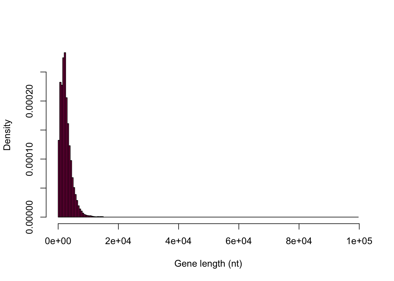
Look at the Y axis: is this the same Y axis as the book?
hist(HumanGeneLengths$gene.length, breaks=myBreaks, xlim = c(0,15000), col="deeppink4", main="", xlab="Gene length (nt)", freq=T) 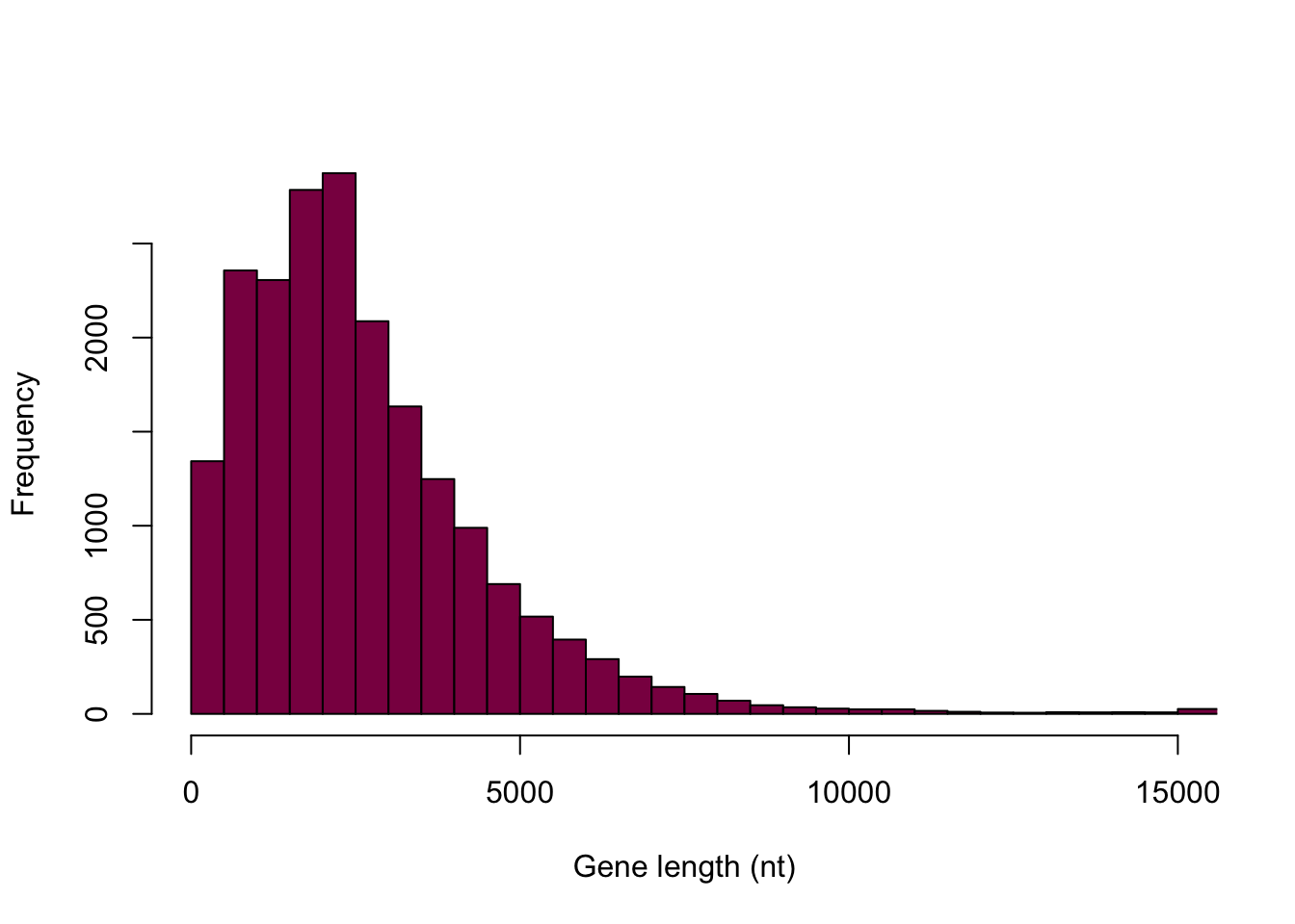
It’s not the same Y axis.
What is the difference between frequency of a class and counts of observation per class?
hist(HumanGeneLengths$gene.length, breaks=myBreaks, xlim = c(0,15000), col="deeppink4", main="", xlab="Gene length (nt)", freq=F)
The first histogram displays counts in the bins and adding them together should sum to the number of observations in total. It shows the absolute frequencies. The second histogram displays the relative frequencies (absolute frequency / total number of observations) and should sum up to 1 - this is still not the exact same scale as we see in the book, however, the goal is not to make an exact carbon copy. This is the best we can do here and the point is really just to understand the difference between absolute and relative frequencies.
Take me back to the beginning!
2. Generating Figure 4.1-2
Use the R function sample() to get a vector of 100 observations drawn from HumanGeneLengths and reproduce fig 4.1-2
Hint: Here is a simple example to draw 5 numbers with replacement from a “made-up” empirical distribution - adapt that for your purposes.
madeup=c(3,3,4,5,6,7,8,2,1,3,5,6,12,435,23)
sample(x = madeup, size = 5,replace = T) # Q:what are the options x=, size= and replace=  specifying here (check the help)?
## [1] 3 5 5 4 435x: the data that we want to draw samples from
size: the size of the sample that we want to take
replace: whether or not we want to sample with replacement
Discuss what is the conceptual difference between replace = T and replace = F (what should we use here?)
replace = T: sampling WITH replacement - when we sample with replacement, the sample values (sampled units) are independent
replace = F: sampling WITHOUT replacement - in this case the sample values are not independent, because what we pick as a first value will affect what we can pick as a second value - this complicates computations
As we want a random sample (where each unit has equal chance of being picked and the selection of units is independent), we should sample with replacement.
hist(sample(x = HumanGeneLengths$gene.length, size = 100,replace = T),
     breaks=myBreaks,
     xlim = c(0,15000),
     col="deeppink4",
     main="",
     xlab="Gene length (number of nucleotides)",
freq=T) 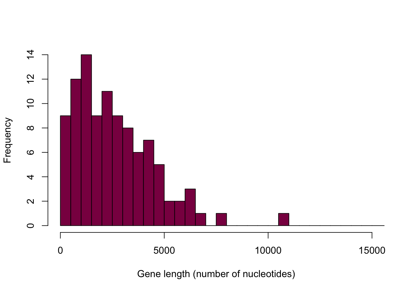
Notice how this histogram is different every single time we run the code - it is due to the randomness in sampling.
Take me back to the beginning!
3. Reproducing Figures 4.1-3 and 4.1-4
Conceptually, to generate by simulation the sampling distribution of mean gene length, we resample 100 datapoints, we calculate the mean in the sample and “write it down” and repeat that operation many times (say 10^4 times).
In most programming languages there is a way to “repeat” a sequence of things x times —> the for loop. Here is one basic example:
for (year in c(2010,2011,2012,2013,2014,2015)){
  print(paste("The year is", year))
}
## [1] "The year is 2010"
## [1] "The year is 2011"
## [1] "The year is 2012"
## [1] "The year is 2013"
## [1] "The year is 2014"
## [1] "The year is 2015"Here the print statement is executed with various values of the year, but you can also use that to do something just 10 times.
for (i in 1:10) {
  tryit=sample(x = madeup, size = 5,replace = T) #we take the sample
  mymedian=median(tryit) #we calculate the median of the sample
  cat("And the median is: ", mymedian, "\n") #we concatenate and print it out
}
## And the median is: 5
## And the median is: 5
## And the median is: 8
## And the median is: 5
## And the median is: 4
## And the median is: 6
## And the median is: 3
## And the median is: 6
## And the median is: 3
## And the median is: 4Or we can be smart and instead of “printing it” we “write it down” i.e. store that in a vector:
myMedians = NULL # this initializes a "nullvector"
for (i in 1:10) {
  tryit=sample(x = madeup, size = 5,replace = T)
  myMedians[i]=median(tryit) #we add the calculated medians to the nullvector
}
myMedians
## [1] 6 23 6 23 4 7 3 7 3 7Adapt this code to generate fig 4.1-3 and 4.1-4 (use 10^4 samples to get the sampling distributions).
#nullvectors for the means (different sample sizes)
meanLength_100 = NULL
meanLength_20 = NULL
meanLength_500 = NULL

for (i in 1:10000) {
  # taking the samples with different sample sizes
  sample_100 = sample(x = HumanGeneLengths$gene.length, size = 100, replace = T)
  sample_20 = sample(x = HumanGeneLengths$gene.length, size = 20, replace = T)
  sample_500 = sample(x = HumanGeneLengths$gene.length, size = 500, replace = T)
  # calculating the means
  meanLength_100[i] = mean(sample_100)
  meanLength_20[i] = mean(sample_20)
  meanLength_500[i] = mean(sample_500)
}

par(mfrow=c(3,1)) # creating the 3*1 figure layout

hist(meanLength_20,
     breaks = 80,
     col = "deeppink4",
     main = "Sample size = 20",
     xlab = "",
     freq = F,
     xlim = c(1000,5200))

hist(meanLength_100,
     breaks = 80,
     col = "deeppink4",
     main = "Sample size = 100",
     xlab = "",
     freq = F,
     xlim = c(1000,5200))

hist(meanLength_500,
     breaks = 80,
     col = "deeppink4",
     main = "Sample size = 500",
     xlab = "Sample mean length",
     freq = F,
     xlim = c(1000,5200))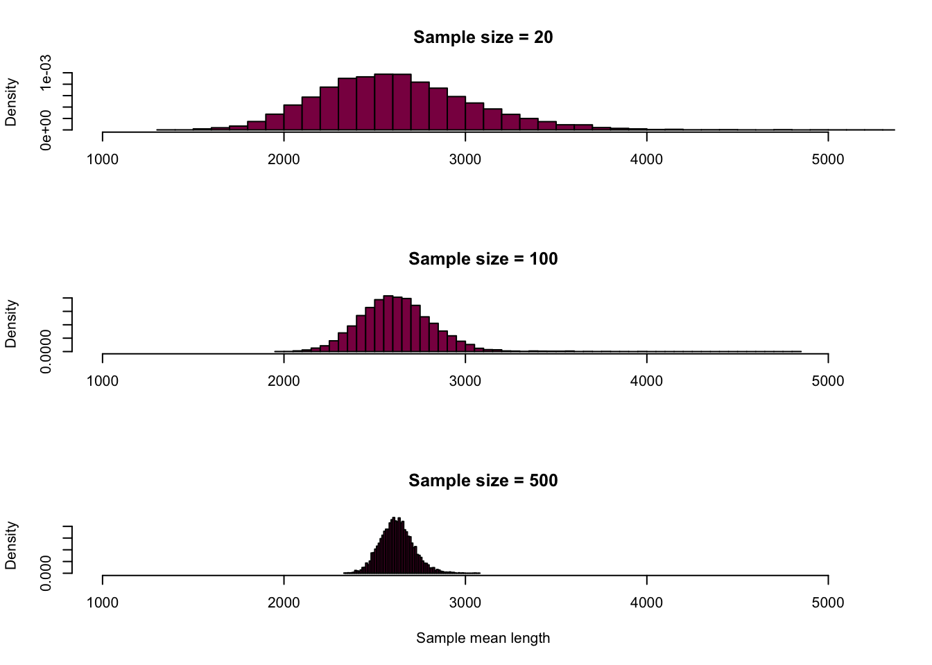
# putting it all together on a "fancier" plot
ggplot() + #creates the canvas
  geom_histogram(mapping = aes(x = meanLength_20, y=..density..), fill = "red", alpha = 0.6, binwidth = 50, col = "black") + #adds the first histogram
  geom_histogram(mapping = aes(meanLength_100, y=..density..), fill = "green", alpha = 0.6, binwidth = 50, col = "black") + # adds the second histogram on top of the first
  geom_histogram(mapping = aes(meanLength_500, y=..density..), fill = "deeppink4", alpha = 0.6, binwidth = 50, col = "black") + # adds the third histogram on top
  xlab("Sample mean length")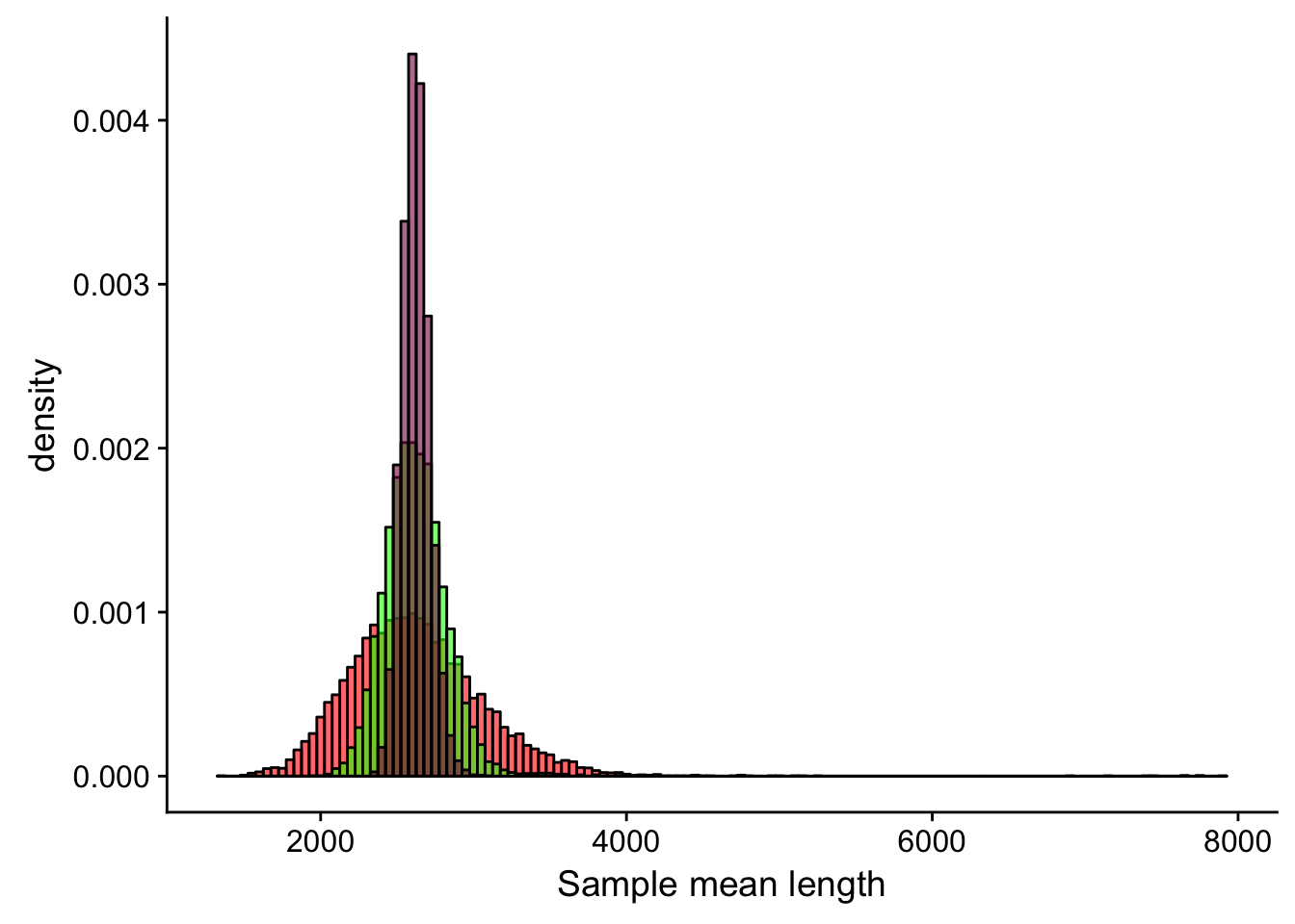
Derive the sampling distribution for the SD in the sample and the median.
Standard deviation:
# this is the exact same code, I'm just calculating the standard deviation instead of the mean

sdLength_100 = NULL
sdLength_20 = NULL
sdLength_500 = NULL

for (i in 1:10000) {
  sample_100_sd = sample(x = HumanGeneLengths$gene.length, size = 100, replace = T)
  sample_20_sd = sample(x = HumanGeneLengths$gene.length, size = 20, replace = T)
  sample_500_sd = sample(x = HumanGeneLengths$gene.length, size = 500, replace = T)
  sdLength_100[i] = sd(sample_100_sd)
  sdLength_20[i] = sd(sample_20_sd)
  sdLength_500[i] = sd(sample_500_sd)
}

par(mfrow=c(3,1))

hist(sdLength_20,
     breaks = 180,
     col = "deeppink4",
     main = "Sample size = 20",
     xlab = "",
     freq = F)

hist(sdLength_100,
     breaks = 180,
     col = "deeppink4",
     main = "Sample size = 100",
     xlab = "",
     freq = F)

hist(sdLength_500,
     breaks = 180,
     col = "deeppink4",
     main = "Sample size = 500",
     xlab = "Sample standard deviation",
     freq = F)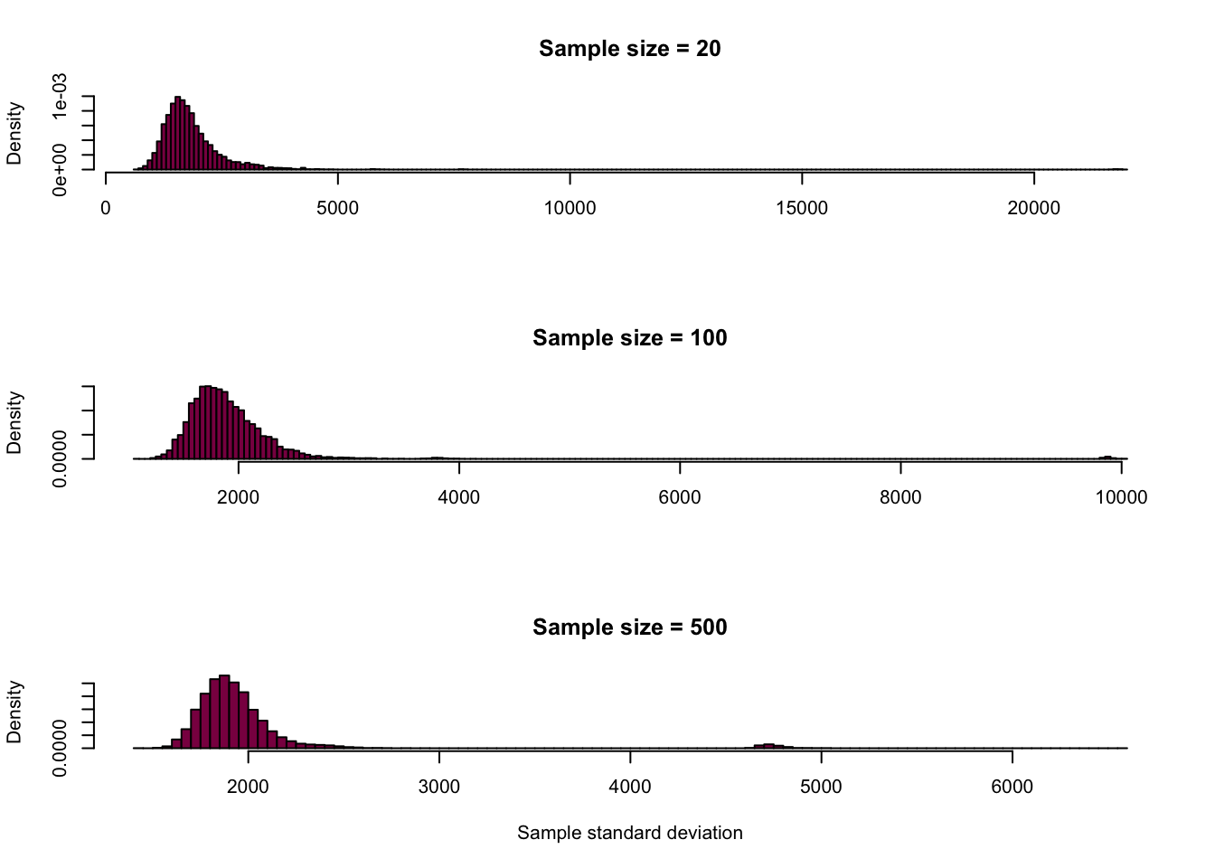
ggplot() +
  geom_histogram(mapping = aes(x = sdLength_20, y=..density..), fill = "red", alpha = 0.6, binwidth = 30) +
  geom_histogram(mapping = aes(sdLength_100, y=..density..), fill = "green", alpha = 0.6, binwidth = 30) +
  geom_histogram(mapping = aes(sdLength_500, y=..density..), fill = "deeppink4", alpha = 0.6, binwidth = 30) +
  xlab("Sample standard deviation")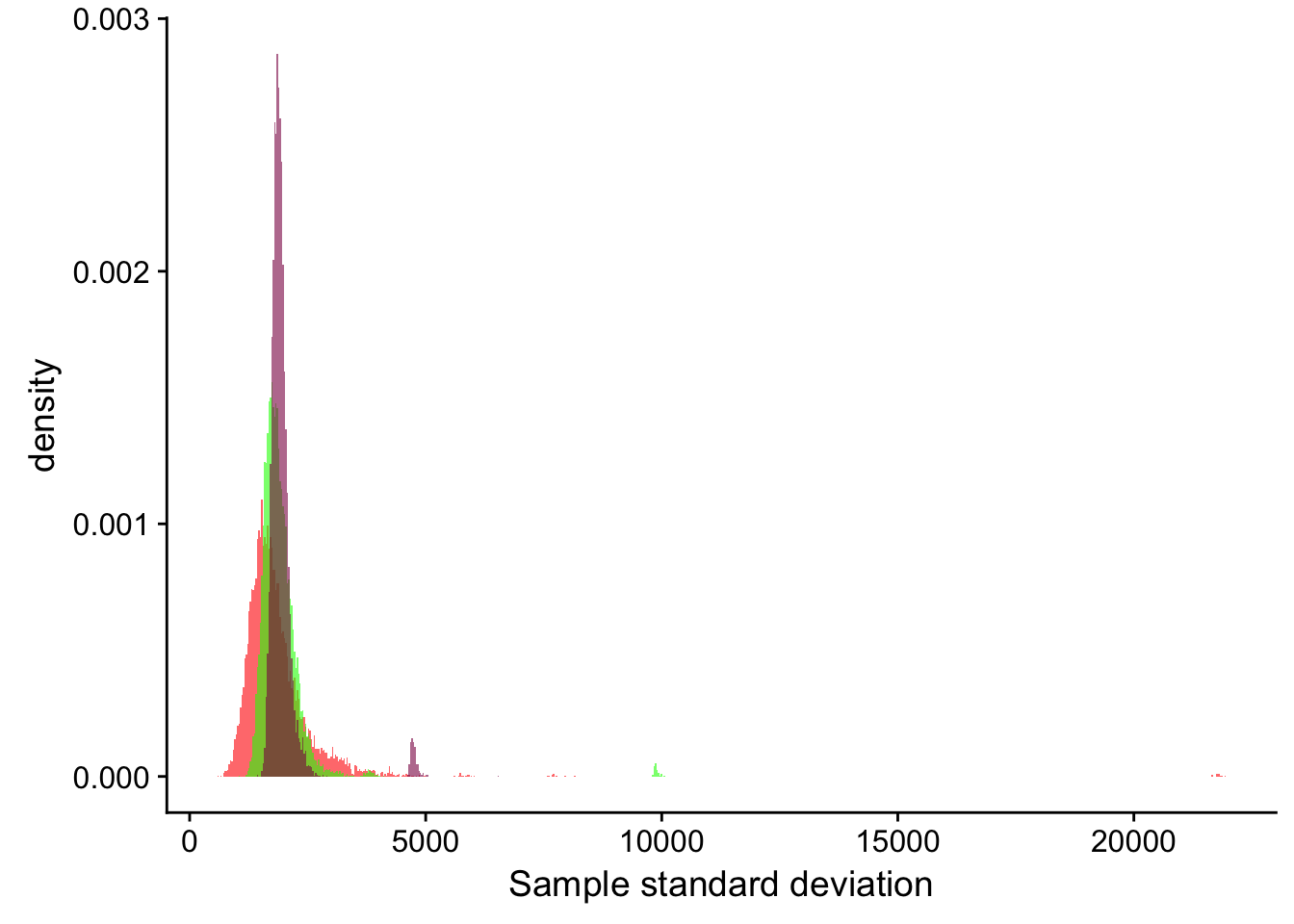
Median:
# also the exact same code, just calculating the median

medianLength_100 = NULL
medianLength_20 = NULL
medianLength_500 = NULL

for (i in 1:10000) {
  sample_100_median = sample(x = HumanGeneLengths$gene.length, size = 100, replace = T)
  sample_20_median = sample(x = HumanGeneLengths$gene.length, size = 20, replace = T)
  sample_500_median = sample(x = HumanGeneLengths$gene.length, size = 500, replace = T)
  medianLength_100[i] = median(sample_100_median)
  medianLength_20[i] = median(sample_20_median)
  medianLength_500[i] = median(sample_500_median)
}

par(mfrow=c(3,1))

hist(medianLength_20,
     breaks = 180,
     col = "deeppink4",
     main = "Sample size = 20",
     xlab = "",
     freq = F)

hist(medianLength_100,
     breaks = 180,
     col = "deeppink4",
     main = "Sample size = 100",
     xlab = "",
     freq = F)

hist(medianLength_500,
     breaks = 180,
     col = "deeppink4",
     main = "Sample size = 500",
     xlab = "Sample median",
     freq = F)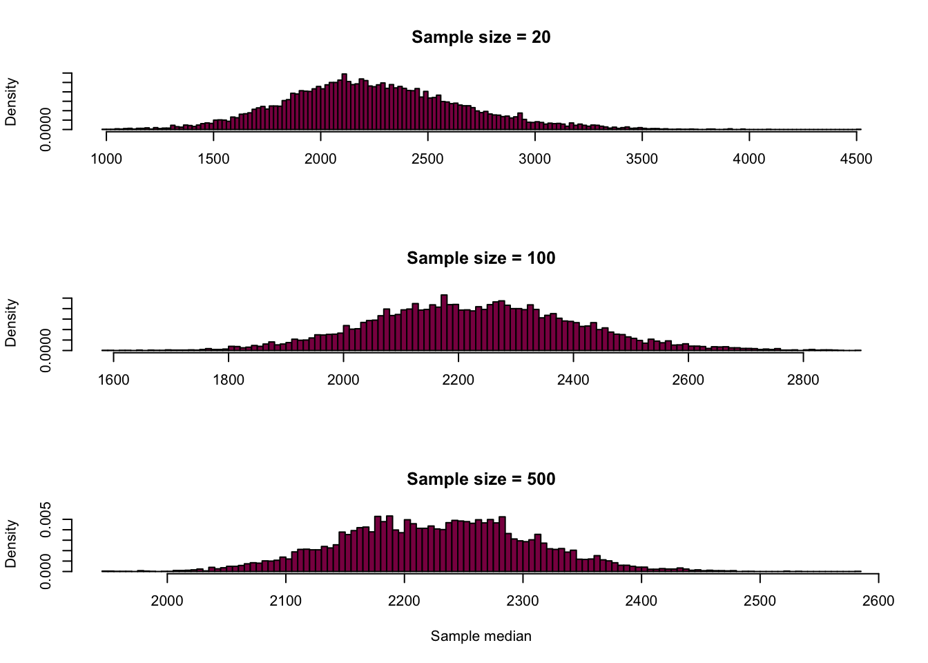
ggplot() +
  geom_histogram(mapping = aes(x = medianLength_20, y=..density..), fill = "red", alpha = 0.6, binwidth = 20, col = "black") +
  geom_histogram(mapping = aes(medianLength_100, y=..density..), fill = "green", alpha = 0.6, binwidth = 20, col = "black") +
  geom_histogram(mapping = aes(medianLength_500, y=..density..), fill = "deeppink4", alpha = 0.6, binwidth = 20, col = "black") +
  xlab("Sample median")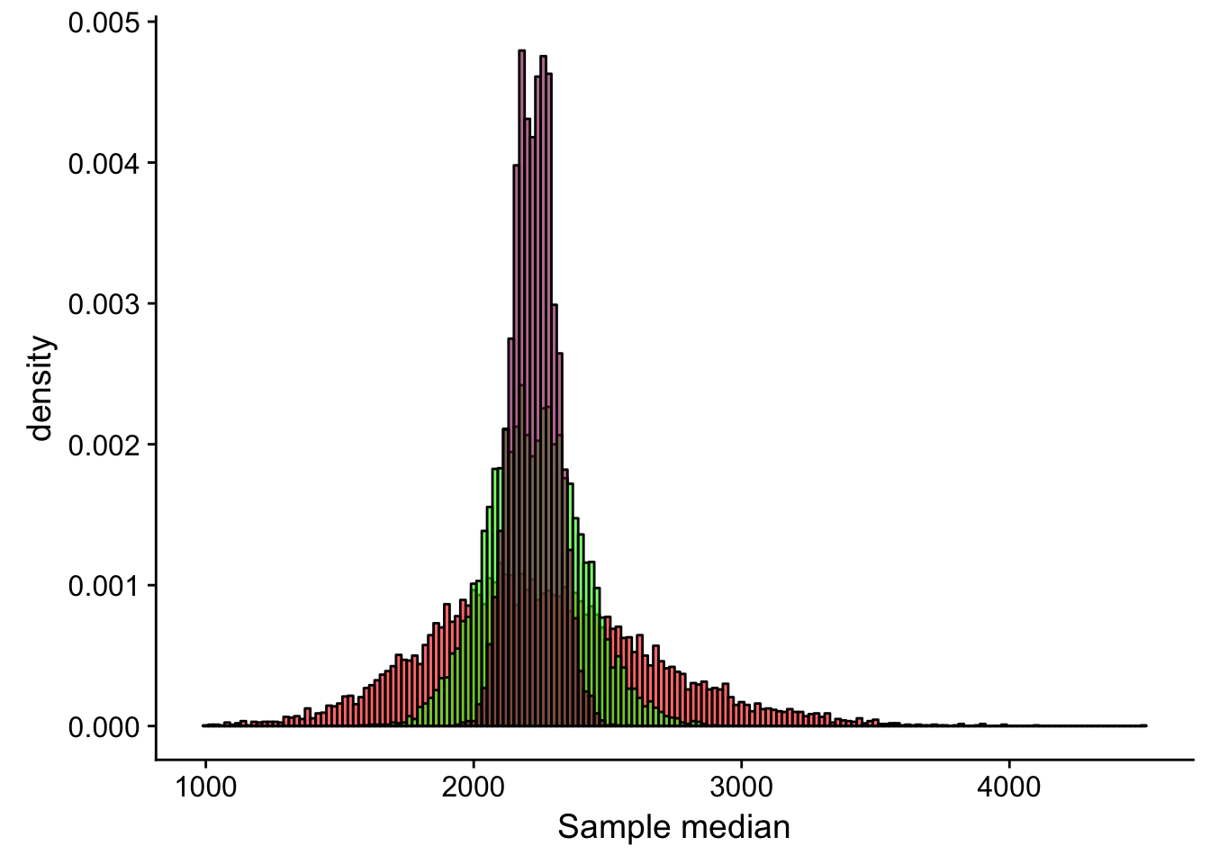
Compare the statistical precision we have to estimate mean SD and median: is the summary statistic that entails most uncertainty?
So we created all these nice sampling distributions and we can calculate the standard error to get an idea about their uncertainty:
sd(meanLength_20)/sqrt(20)## [1] 100.8671sd(meanLength_100)/sqrt(100)## [1] 20.48314sd(meanLength_500)/sqrt(500)## [1] 4.057937sd(sdLength_20)/sqrt(20)## [1] 216.6111sd(sdLength_100)/sqrt(100)## [1] 63.66825sd(sdLength_500)/sqrt(500)## [1] 20.30935sd(medianLength_20)/sqrt(20)## [1] 93.10885sd(medianLength_100)/sqrt(100)## [1] 17.87735sd(medianLength_500)/sqrt(500)## [1] 3.5581We can see that if we compare the precision of our estimates given the 3 sample sizes, the n = 500 estimate is the most precise which is expected. If we take a look at the different summary statistics at the same sample sizes, we find that the median estimate is the least uncertain - this is also expected given that this statistic is the most resistant to the influence of the outliers while the mean and standard deviation are more sensitive to them (remember, the standard deviation is the most uncertain - it is calculated using the mean, which was already pretty sensitive to extreme observations!).
Take me back to the beginning!
4. Trying and evaluating the +/- 2 SEs rule of thumb
Generate 20 samples of n=100 genes from the human gene length distribution, for each sample calculate the mean and CI around the mean using 2SEs
Mean = NULL
SE = NULL
epoch = NULL # don't worry about this, I just needed it for plotting purposes
sample_size = 100

for(i in 1:20){
  sample <- sample(x = HumanGeneLengths$gene.length, size = sample_size,replace = T)
  Mean[i] = mean(sample)
  SE[i] = sd(sample)/sqrt(sample_size)
  epoch[i] = i
}
# putting it all together in a nice dataframe
df <- data.frame() #creating an empty dataframe
df <- data.frame(cbind(epoch, Mean, SE, Mean-2*SE, Mean+2*SE, sample_size)) #binding the columns together
colnames(df) <- c("Sample_nr", "Mean", "Standard_error", "Lower_confidence_limit", "Upper_confidence_limit", "Sample_size") #naming the columns in the dataframe

# a fancy plot to visualize the CIs
ggplot() +
  geom_point(data = df, aes(y = Sample_nr, x = Mean)) +
  geom_segment(data = df, aes(x = Lower_confidence_limit,
                              xend = Upper_confidence_limit,
                              y = Sample_nr,
                              yend = Sample_nr)) +
  geom_vline(xintercept = mean(HumanGeneLengths$gene.length), col = "deeppink4")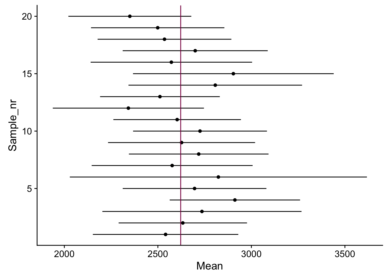
How many intervals out of 20 “cover” the true mean? Is that what we expect for a 95% CI? (if you repeat that several times, numbers vary a bit)
It depends - I ran this code several times and sometimes every interval covered the true mean, sometimes only 17 out of 20, etc. This is not exactly what we would expect from a 95% CI, however, the 2SE rule of thumb is just an approximation and keeping this in mind, it works relatively well.
Just to demonstrate how the CIs change when the sample size gets bigger, let’s increase the sample size…
Mean_1000 = NULL
SE_1000 = NULL
epoch_1000 = NULL
sample_size = 1000


for(i in 1:20){
  sample_1000 <- sample(x = HumanGeneLengths$gene.length, size = sample_size,replace = T)
  Mean_1000[i] = mean(sample_1000)
  SE_1000[i] = sd(sample_1000)/sqrt(1000)
  epoch_1000[i] = 20+i
}
df_1000 <- data.frame(epoch_1000, Mean_1000, SE_1000, Mean_1000-2*SE_1000, Mean_1000+2*SE_1000, sample_size)
colnames(df_1000) <- c("Sample_nr", "Mean", "Standard_error", "Lower_confidence_limit", "Upper_confidence_limit", "Sample_size")
df <- data.frame(rbind(df, df_1000))

Mean_100000 = NULL
SE_100000 = NULL
epoch_100000 = NULL
sample_size = 100000

for(i in 1:20){
  sample_100000 <- sample(x = HumanGeneLengths$gene.length, size = sample_size,replace = T)
  Mean_100000[i] = mean(sample_100000)
  SE_100000[i] = sd(sample_100000)/sqrt(100000)
  epoch_100000[i] = 40+i
}
df_100000 <- data.frame(epoch_100000, Mean_100000, SE_100000, Mean_100000-2*SE_100000, Mean_100000+2*SE_100000, sample_size)
colnames(df_100000) <- c("Sample_nr", "Mean", "Standard_error", "Lower_confidence_limit", "Upper_confidence_limit", "Sample_size")
df <- data.frame(rbind(df, df_100000))
Putting it all together:
ggplot() +
  geom_point(data = df, aes(y = Sample_nr, x = Mean, color = as.factor(df$Sample_size))) +
  geom_segment(data = df, aes(x = Lower_confidence_limit ,
                              xend = Upper_confidence_limit,
                              y = Sample_nr,
                              yend = Sample_nr,
                              color = as.factor(df$Sample_size))) +
  geom_vline(xintercept = mean(HumanGeneLengths$gene.length)) +
  ylab("") +
  scale_color_discrete(name = "Sample Size") +
  theme(
  axis.text.y = element_blank(),
  axis.ticks.y = element_blank(),
axis.line.y = element_blank()) 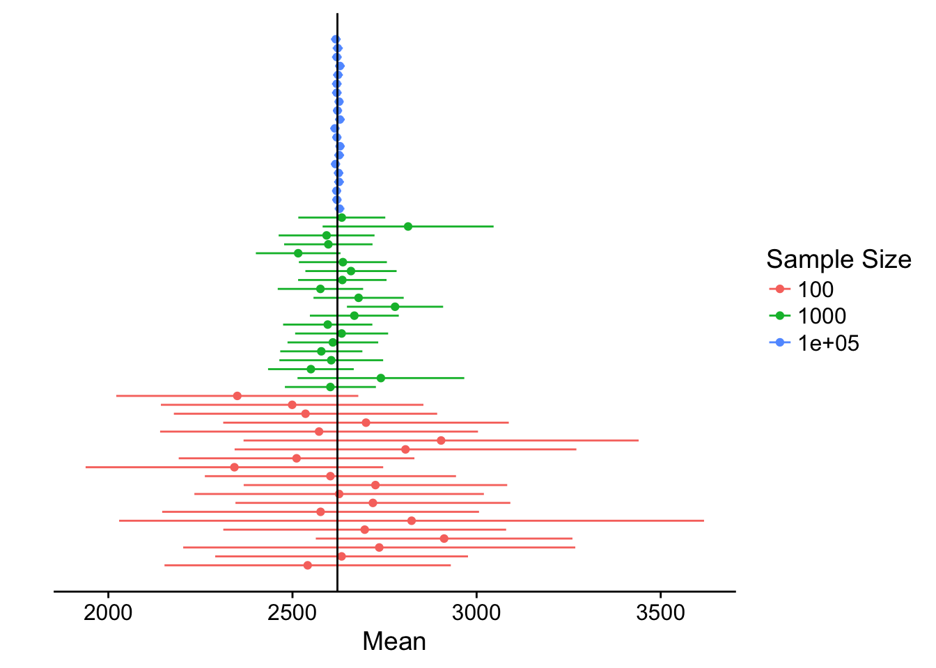
We can see that the bigger the sample size, the narrower the confidence interval - hence, we have more certainty in our estimate.
Take me back to the beginning!