Week 2: Summary statistics
Wed, Feb 7, 2018 Made by Judit Kisistók, incorporating some snippets from Moisés Coll Maciá's solution sheet. The R exercise session was created by Thomas Bataillon and Palle Villesen at Aarhus University.Learning goals
By the end of this session, you should be able to…
- load datasets in R from the ABD package
- calculate summary statistics by hand and using the summary stats functions in R
- slice data in R (selecting subsets of data)
- create data but also sample data from a first theoretical distribution and discuss how much samples from this distribution are close to the real observed data
- be good at making the correspondance between summary statistics (mean, median, SD, etc.) and graphical representation of the data by:
- histograms
- boxplots
- cumulative frequency distributions
1. Calculating summary statistics in a sample
Here is how you can “make” your own data sample (redo Exercise 3.1 in R)
myDataNyHand=c(1.23,1.5,2,3,4,1,4) ## a new vector
# c stands for concatenation - so here you're essentially concatenating a bunch of numbers together into a vector
Create a vector containing the data in Example 3 3.1.
data=c(0.9, 1.4, 1.2, 1.2, 1.3, 2.0, 1.4, 1.6)Check with pencil and paper and with R that you can calculate all the summary statistics presented in the book example (mean, median, SD, quantiles), then check with the R function how to get these statistics directly.
meanOfData = mean(data)
meanOfData
## [1] 1.375SDOfData = sd(data)
SDOfData## [1] 0.324037quantile(data)## 0% 25% 50% 75% 100%
## 0.90 1.20 1.35 1.45 2.00# to get the interquartile range, we subtract the 25% quantile (1st quartile) from the 75% quantile (= 3rd quartile), so it's going to be 1.45 - 1.20 = 0.25Take me back to the beginning!
2. Summarizing and visualizing the Stickleback data of Chapter 3
First, we import some libraries (if you haven’t installed this, then first you need to do so using the install.packages() function):
library(abd) # this is what we need for the data
library(cowplot) # don't worry about this, I'll just use it for plotting
Then, we obtain the Stickleback data from the abd package:
data("SticklebackPlates") # getting the dataset - this only works if a dataset is included in a package, otherwise you need another data import method (eg. read.csv() for comma-separated data)
head(SticklebackPlates) # a quick peek at the dataset - useful for seeing the variables and the first couple datapoints
## genotype plates
## 1 mm 11
## 2 Mm 63
## 3 Mm 22
## 4 Mm 10
## 5 mm 14
## 6 mm 11names(SticklebackPlates) # this way you can get the name of each dataset column (aka variable)## [1] "genotype" "plates"You can get an overview of the data in one single function:
summary(SticklebackPlates)## genotype plates
## mm: 88 Min. : 6.00
## Mm:174 1st Qu.:14.00
## MM: 82 Median :57.00
## Mean :43.43
## 3rd Qu.:62.00
## Max. :69.00Here you’ll also see the variables and some summary statistics like the mean and the median.
What is the sample size?
Adding up all genotypes from the summary table: 88 + 174 + 82 = 344
What is the mean and the median?
You can also see this in the summary table. Mean: 43.43 Median: 57
What is the SD of the data ? Is that info in summary()?
It’s not, but it’s easy to calculate it anyway:
sd(SticklebackPlates$plates)## [1] 22.23716Note that you need to choose which column you want to use for the calculation - this is achieved with the $. If you didn’t do this and just wrote sd(SticklebackPlates), R wouldn’t know which standard deviation you want as there are multiple variables (genotype, plates) - and in real datasets you often have even more than this.
One fundamental of summarizing data: “slicing” the data in groups and making summary stats by groups.
For instance here is how to select a specific subset meeting one condition - I only want the data matching a specific condition (here the genotype being MM):
dataMM=subset(SticklebackPlates, SticklebackPlates$genotype =="MM")
head(dataMM)
## genotype plates
## 20 MM 64
## 25 MM 65
## 28 MM 62
## 31 MM 63
## 38 MM 60
## 42 MM 64Use R to calculate the summary statistics from the data presented in Table 3.3-1 of the book: for each genotype calculate the sample size, mean, median, SD and interquartile range.
A suggestion is to work on subdataset and use summary() on each subdataset. To do so try subset(). This a super useful / must R function in practice.
1. MM genotype
dataMM=subset(SticklebackPlates, SticklebackPlates$genotype =="MM")
length(dataMM$plates) #sample size
## [1] 82mean(dataMM$plates) #mean## [1] 62.78049median(dataMM$plates) #median## [1] 63sd(dataMM$plates) #standard deviation## [1] 3.410313summary(dataMM$plates) #interquartile range: 64.00-62.00 = 2## Min. 1st Qu. Median Mean 3rd Qu. Max.
## 42.00 62.00 63.00 62.78 64.00 69.002. Mm genotype
dataMm=subset(SticklebackPlates, SticklebackPlates$genotype =="Mm")
length(dataMm$plates) #sample size
## [1] 174mean(dataMm$plates) #mean## [1] 50.37931median(dataMm$plates) #median## [1] 59sd(dataMm$plates) #standard deviation## [1] 15.14687summary(dataMm$plates) #interquartile range: 62.00-41.00 = 21## Min. 1st Qu. Median Mean 3rd Qu. Max.
## 10.00 41.00 59.00 50.38 62.00 68.003. mm genotype
datamm=subset(SticklebackPlates, SticklebackPlates$genotype =="mm")
length(datamm$plates) #sample size
## [1] 88mean(datamm$plates) #mean## [1] 11.67045median(datamm$plates) #median## [1] 11sd(datamm$plates) #standard deviation## [1] 3.567805summary(datamm$plates) #interquartile range: 13.00-10.00 = 3## Min. 1st Qu. Median Mean 3rd Qu. Max.
## 6.00 10.00 11.00 11.67 13.00 37.00Use the subset function above to calculate the SD and the CV for each genotype (MM, Mm and mm).
We have already calculated the standard deviation above. The CV is just (standard deviation / mean)*100%, so:
(sd(dataMM$plates)/mean(dataMM$plates))*100 #CV for the MM genotype## [1] 5.432122(sd(dataMm$plates)/mean(dataMm$plates))*100 #CV for the Mm genotype## [1] 30.06565(sd(datamm$plates)/mean(datamm$plates))*100 #CV for the mm genotype## [1] 30.57126Imagine we scale the data by:
- adding +2, because morphologically some lateral plates are always missed - Scaling 1
- expressing that as standardized number of plates by dividing it by the number by 62.8 (the mean of the most “armored” genotype) - Scaling 2
Create a dataset where the data are scaled according to 1 and 2.
1. Scaling 1
# In Base R, we create a brand new dataframe like this:
SticklebackPlates_scale1 = data.frame(genotype = SticklebackPlates$genotype, plates = SticklebackPlates$plates + 2)
# when we create this new dataframe, we say what columns (variables) we want - this is the "genotype =" and "plates =" part
# then we say what values we want those variables to have
# here we just grab the genotype values from the original dataset as they were, and for the plates, we get the original values as well but we add +2 to every single one of them
For those of you who want to be total R wizards, here’s another solution to the previous problem. It uses a package called dplyr which is part of Tidyverse, a package collection designed to make data science more fun and tidy.
It’s a bit more difficult syntactically, however, once you get used to it, it’s super useful.
SticklebackPlates %>%
  mutate(plates = plates + 2) -> SticklebackPlates_scale1_d
## Warning: package 'bindrcpp' was built under R version 3.4.4# in the first line we choose which data we want to work with
# that weird %>% thing is called a pipe - you can think about our data flowing through it, being channeled into whatever command we have next
# in this case, it's mutate() - which just simply transforms our variable, so adds 2 to every plate value
# at the end, with -> we save all this to another dataframeAt the end of the day, both solutions should give us the same result.
head(SticklebackPlates_scale1)## genotype plates
## 1 mm 13
## 2 Mm 65
## 3 Mm 24
## 4 Mm 12
## 5 mm 16
## 6 mm 13head(SticklebackPlates_scale1_d)## genotype plates
## 1 mm 13
## 2 Mm 65
## 3 Mm 24
## 4 Mm 12
## 5 mm 16
## 6 mm 132. Scaling 2
We can use the exact same principles.
# Base R
SticklebackPlates_scale2 = data.frame(genotype = SticklebackPlates$genotype, plates = SticklebackPlates$plates / 62.8)

# Dplyr
SticklebackPlates %>%
  mutate(plates = plates / 62.8) -> SticklebackPlates_scale2_d

head(SticklebackPlates_scale2)
## genotype plates
## 1 mm 0.1751592
## 2 Mm 1.0031847
## 3 Mm 0.3503185
## 4 Mm 0.1592357
## 5 mm 0.2229299
## 6 mm 0.1751592head(SticklebackPlates_scale2_d)## genotype plates
## 1 mm 0.1751592
## 2 Mm 1.0031847
## 3 Mm 0.3503185
## 4 Mm 0.1592357
## 5 mm 0.2229299
## 6 mm 0.1751592Just to visualize what we have done, here are some plots (it’s not mandatory for you to make any, but they are nice to look at). I made them using the ggplot2 package (also part of the Tidyverse) and put them together using the cowplot package.
# A histogram for the original data:
orig_hist <- ggplot(data = SticklebackPlates) +
              geom_histogram(aes(x = plates, fill = genotype), bins = 30) +
              ggtitle("Original Data")

# A histogram for the first scaling:
scale1_hist <- ggplot(data = SticklebackPlates_scale1) +
            geom_histogram(aes(x = plates, fill = genotype), bins = 30) +
            ggtitle("Original Data")


# A histogram for the second scaling:
scale2_hist <- ggplot(data = SticklebackPlates_scale2) +
            geom_histogram(aes(x = plates, fill = genotype), bins = 30) +
            ggtitle("Scaling 2")

# Let's put them together on a figure:
plot_grid(orig_hist, scale1_hist, scale2_hist, nrow = 3)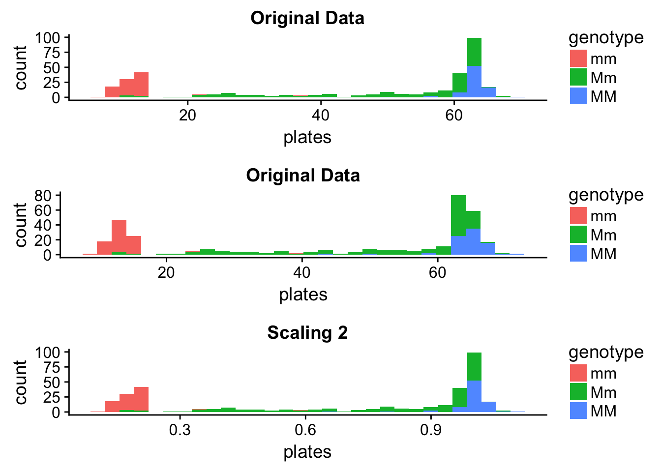
It seems that Scaling 1 changed the distribution - however, this is just an artefact of the plotting that can easily lead us astray. The data have changed, however, we’re plotting with the same intervals. Let’s see what happens if we finetune the binwidths a bit.
# A histogram for the original data:
orig_hist <- ggplot(data = SticklebackPlates) +
              geom_histogram(aes(x = plates, fill = genotype), binwidth = 1) +
              ggtitle("Original Data")

# A histogram for the first scaling:
scale1_hist <- ggplot(data = SticklebackPlates_scale1) +
            geom_histogram(aes(x = plates, fill = genotype), binwidth = 1) +
            ggtitle("Scaling 1")

plot_grid(orig_hist, scale1_hist, nrow = 2)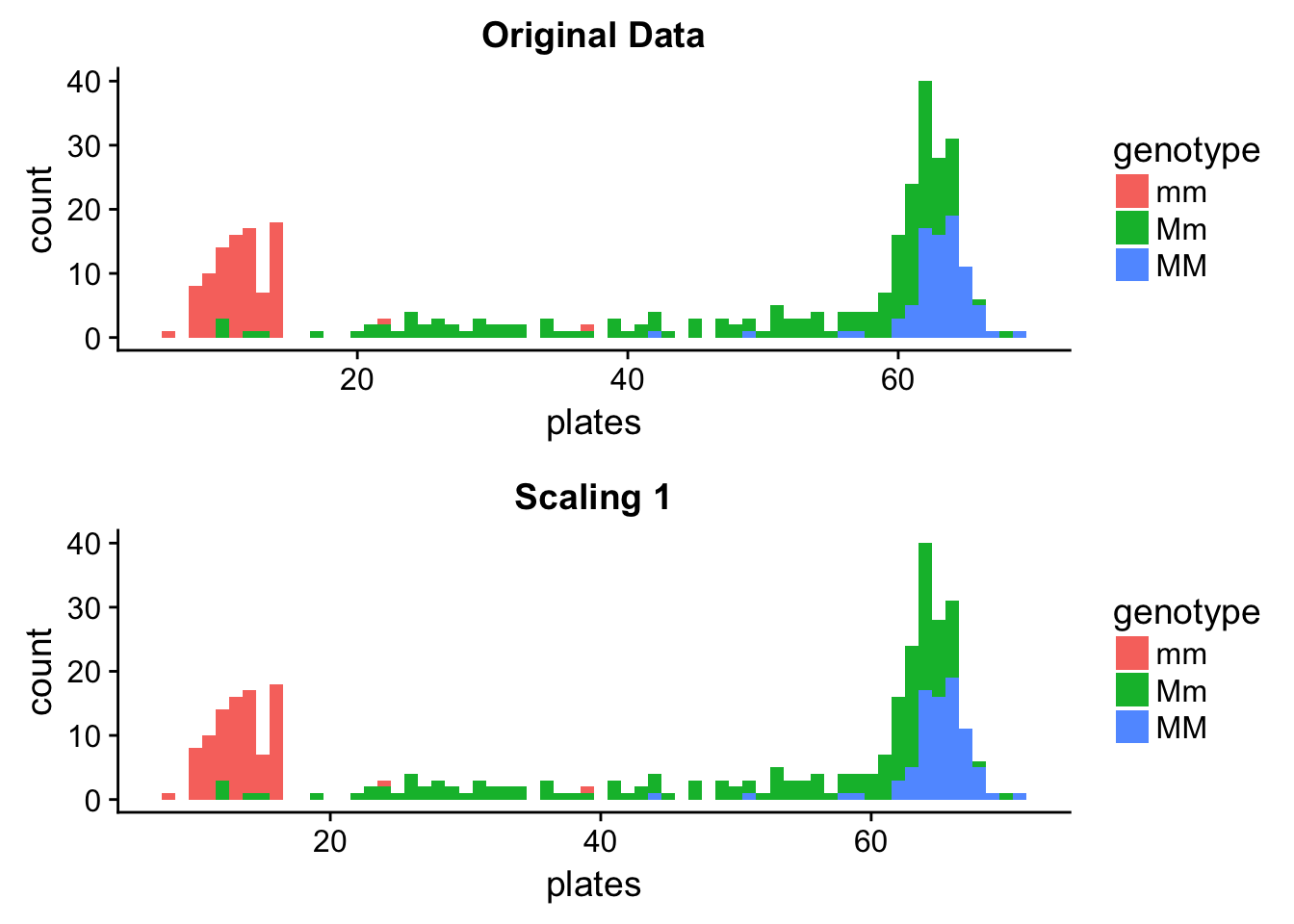
We can see that the distributions are the same - the scaled one is just shifted to the right, and this was enough to make it show up as a different distribution when using a wider binwidth. This illustrates it very well that when you are creating histograms, you might need to try a couple different binwidths and choose the one that you think fits your data best.
Let’s see how the summary statistics have changed:
# Means:
mean(SticklebackPlates$plates) # original data
## [1] 43.43314mean(SticklebackPlates_scale1$plates) # Scaling 1## [1] 45.43314mean(SticklebackPlates$plates) + 2 # Equals the mean of the Scaling 1 data ## [1] 45.43314mean(SticklebackPlates_scale2$plates) # Scaling 2## [1] 0.6916105mean(SticklebackPlates$plates)/62.8 # Equals the mean of the Scaling 2 data ## [1] 0.6916105# Standard deviations:
sd(SticklebackPlates$plates) # original data## [1] 22.23716sd(SticklebackPlates_scale1$plates) # Scaling 1, same as the SD of the original data## [1] 22.23716sd(SticklebackPlates_scale2$plates) # Scaling 2## [1] 0.3540949sd(SticklebackPlates$plates)/62.8 # Equals the SD of the Scaling 2 data## [1] 0.3540949Take me back to the beginning!
3. Developing your intuition for histograms and boxplots
Reproduce figure 3-3-1 in the book using the histogram function hist().
This is how you do it in Base R:
par(mfrow=c(3,1))

hist(dataMM$plates,
     right = FALSE,
     breaks = 15,
     xlim = c(0,max(dataMM$plates)),
     ylim = c(0,40),
     col = "brown",
     main = "",
     xlab = "")

hist(dataMm$plates,
     right = FALSE,
     breaks = 30,
     xlim = c(0,max(dataMM$plates)),
     ylim = c(0,40),
     col = "brown",
     main = "",
     xlab = "")

hist(datamm$plates,
     right = FALSE,
     breaks = 15,
     xlim = c(0,max(dataMM$plates)),
     ylim = c(0,40),
     col = "brown",
     main = "",
     xlab = "Number of lateral plates")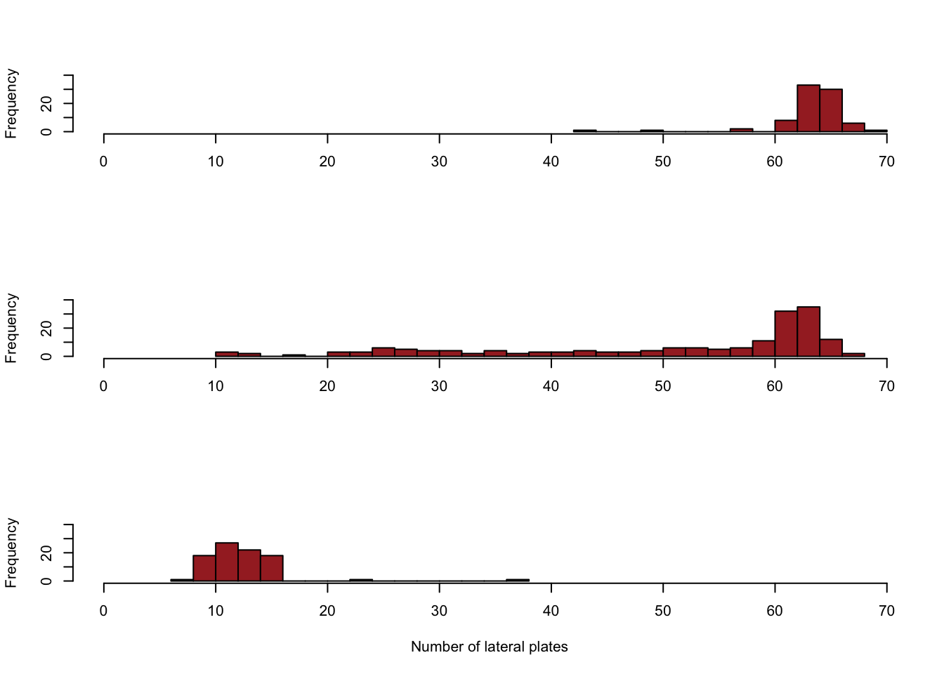
This is how you do it in ggplot2 (okay, this is pretty complex but hey, at least it’s fancy, right?):
plot_MM <- ggplot(data = dataMM) +
          geom_histogram(aes(x = plates), fill = "deeppink4", col = "black", binwidth = 2) +
          annotate("text", x = 0, y = 35, label = "italic(MM)", parse=TRUE) +
  scale_y_continuous(breaks=c(seq(0,40,10)), name = "", labels = seq(0,40,10), limits = c(0,40)) +
  scale_x_continuous(breaks=c(seq(0,70,10)), name = "", labels = NULL , limits = c(0,70))


plot_Mm <- ggplot(data = dataMm) +
          geom_histogram(aes(x = plates), fill = "deeppink4", col = "black", binwidth = 2) +
          annotate("text", x = 0, y = 35, label = "italic(Mm)", parse=TRUE) +
  scale_y_continuous(breaks=c(seq(0,40,10)), name = "", labels = seq(0,40,10), limits = c(0,40)) +
  scale_x_continuous(breaks=c(seq(0,70,10)), name = "", labels = NULL , limits = c(0,70))


plot_mm <- ggplot(data = datamm) +
          geom_histogram(aes(x = plates), fill = "deeppink4", col = "black", binwidth = 2) +
          annotate("text", x = 0, y = 35, label = "italic(mm)", parse=TRUE) +
  scale_y_continuous(breaks=c(seq(0,40,10)), name = "", labels = seq(0,40,10), limits = c(0,40)) +
  scale_x_continuous(breaks=c(seq(0,70,10)), name = "", labels = NULL , limits = c(0,70))


plot_grid(plot_MM, plot_Mm, plot_mm, nrow =  3) +
draw_label("Number of lateral plates", fontface = "bold", y = 0.02) 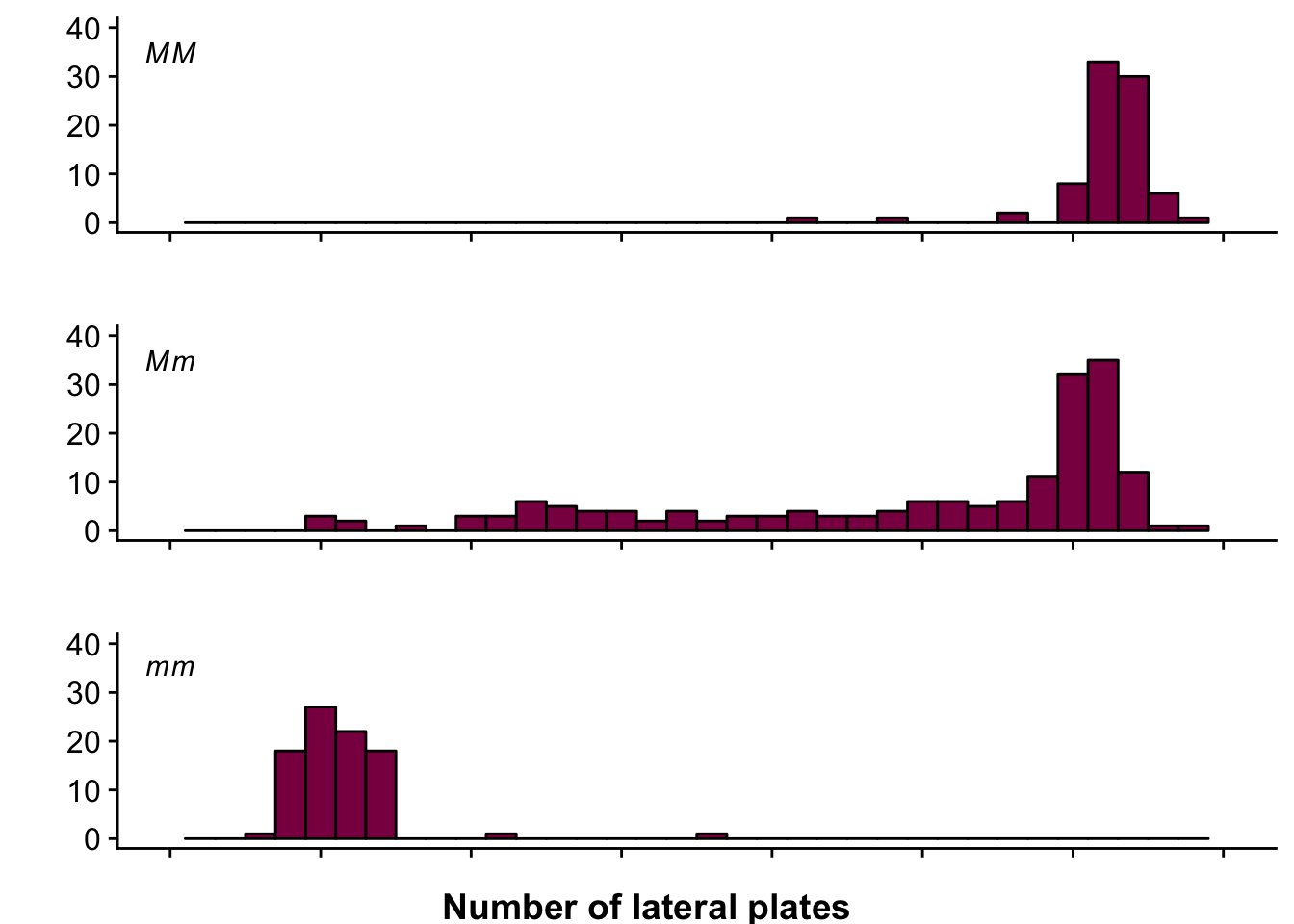
Complement the figure by doing a side by side boxplot for each genotype (hint: use boxplot() ).
boxplot(SticklebackPlates$plates ~ SticklebackPlates$genotype) 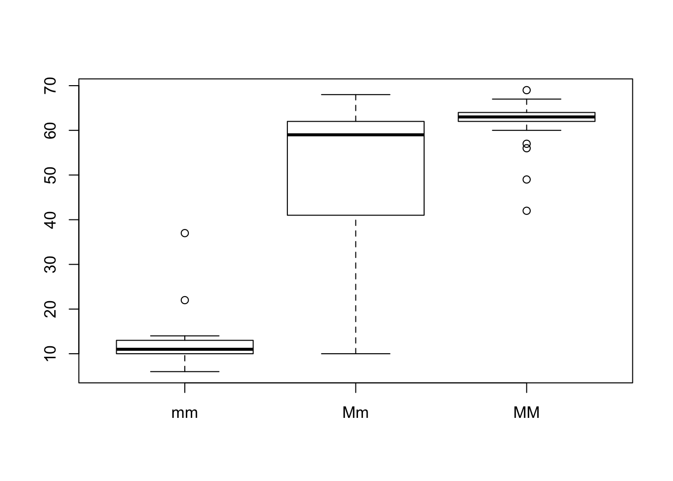
# first you say what the numerical variable should be that you want to plot (here: plates)
# then you say what categories your data has, which will create the different boxplots (here: genotype)
Sketch by hand and do in R a graph of the cumulative distribution of the number of lateral plates in the Sticklebacks data. (hint: Google it!)
plot(ecdf(dataMm$plates), main = "Cumulative distribution", xlab = "Number of lateral plates", pch = ".")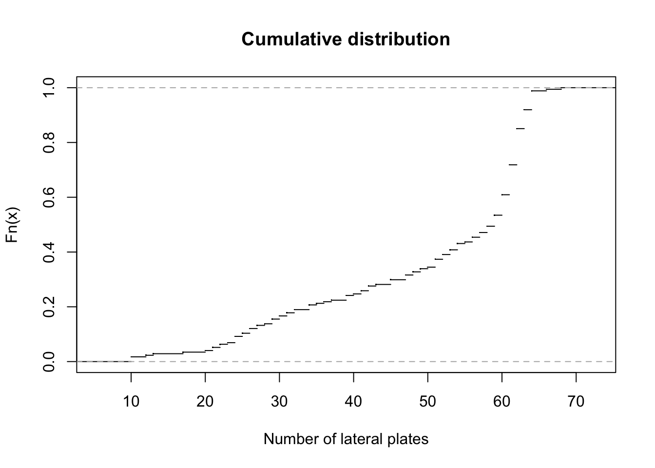
# ecdf: Empirical Cumulative Distribution Function - we want to plot it
# pch stands for plotting character - it's responsible for how your plotted points look
Take me back to the beginning!
4. Making up your own data by sampling from a theoretical distribution
In R, you can very easily “draw” observations from the normal distribution (pictured in Fig 1-4.2, described in Chapter 10).
meanOfMM=62.8 #the observed mean of MM individuals
SDOfMM=3.4 # standard deviation of the MM individuals
myFakeSample=rnorm(n = 82, mean = meanOfMM, sd=SDOfMM) ## 82 independent observations drawn from the normal distribution that matches the data (aka has the same mean and standard deviation as the original data)
myFakeSample
## [1] 62.21598 62.56650 60.56192 56.46063 66.64780 63.00325 59.28405
## [8] 63.39111 61.87695 63.76206 59.60212 58.83454 64.58464 68.19543
## [15] 57.46737 63.76085 63.33494 63.27365 56.51900 62.53294 64.95118
## [22] 62.55140 63.21473 63.93337 63.25949 66.61954 67.48270 60.20259
## [29] 66.07408 66.11685 56.28289 65.44658 62.22220 59.20998 61.43410
## [36] 57.25053 60.83972 62.85512 60.05243 58.79233 58.78839 61.98708
## [43] 63.36770 64.66352 63.54574 60.26681 62.91429 65.30839 64.66086
## [50] 69.06520 59.96230 56.13530 62.48157 65.44182 63.10358 65.09655
## [57] 61.03711 67.80094 60.55239 57.94264 57.55042 62.17577 62.45611
## [64] 63.74081 62.65644 56.85793 57.33690 64.99950 68.47150 63.15169
## [71] 61.02754 63.10127 61.66213 65.10497 65.32784 63.94380 68.28017
## [78] 62.52775 56.78091 63.25753 61.35960 66.31586hist(myFakeSample)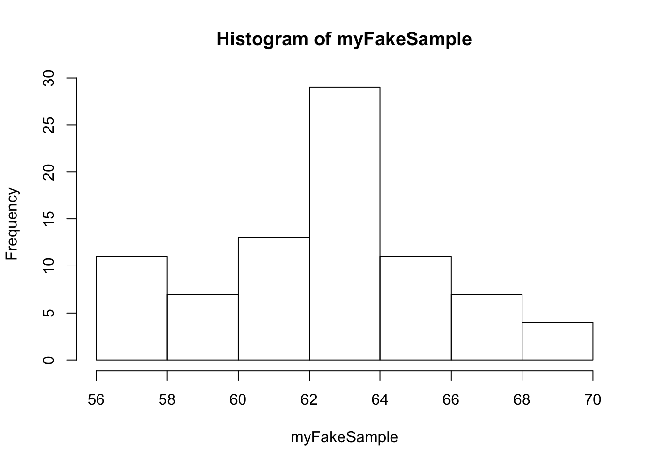
rnorm: draws values from the normal distribution, n is the number of samples drawn, mean and sd is the mean and standard distribution of the normal distribution we’re drawing from.
Discuss to what extent is this fake sample a good “match” to the actual data.
It’s a good idea to generate fake samples for every genotype, then plot them to see how well the distributions match.
# drawing samples
fakeMM=rnorm(n = length(dataMM$plates), mean = mean(dataMM$plates), sd=sd(dataMM$plates))
# putting them in a dataframe for plotting purposes
fakeMM_df <- data_frame(genotype = rep("MM", length(fakeMM)),
                        plates = fakeMM)

fakeMm=rnorm(n = length(dataMm$plates), mean = mean(dataMm$plates), sd=sd(dataMm$plates))

fakeMm_df <- data_frame(genotype = rep("Mm", length(fakeMm)),
                        plates = fakeMm)

fakemm=rnorm(n = length(datamm$plates), mean = mean(datamm$plates), sd=sd(datamm$plates))

fakemm_df <- data_frame(genotype = rep("mm", length(fakemm)),
                        plates = fakemm)
Let’s do it in Base R first:
par(mfrow = c(3, 2))

plot1b <- hist(dataMM$plates,
               breaks = 30,
               col = "deeppink4",
               xlim = c(0, 100),
               ylim = c(0, 25),
               xlab = "",
               main = "Real MM")

plot2b <- hist(fakeMM_df$plates,
               breaks = 30,
               col = "deeppink4",
               xlim = c(0, 100),
               ylim = c(0, 25),
               xlab = "",
               main = "Fake MM")

plot3b <- hist(dataMm$plates,
               breaks = 50,
               col = "deeppink4",
               xlim = c(0, 100),
               ylim = c(0, 25),
               xlab = "",
               main = "Real Mm")

plot4b <- hist(fakeMm_df$plates,
               breaks = 50,
               col = "deeppink4",
               xlim = c(0, 100),
               ylim = c(0, 25),
               xlab = "",
               main = "Fake Mm")

plot5b <- hist(datamm$plates,
               breaks = 30,
               col = "deeppink4",
               xlim = c(0, 100),
               ylim = c(0, 25),
               xlab = "",
               main = "Real mm")

plot6b <- hist(fakemm_df$plates,
               breaks = 30,
               col = "deeppink4",
               xlim = c(0, 100),
               ylim = c(0, 25),
               xlab = "",
               main = "Fake mm")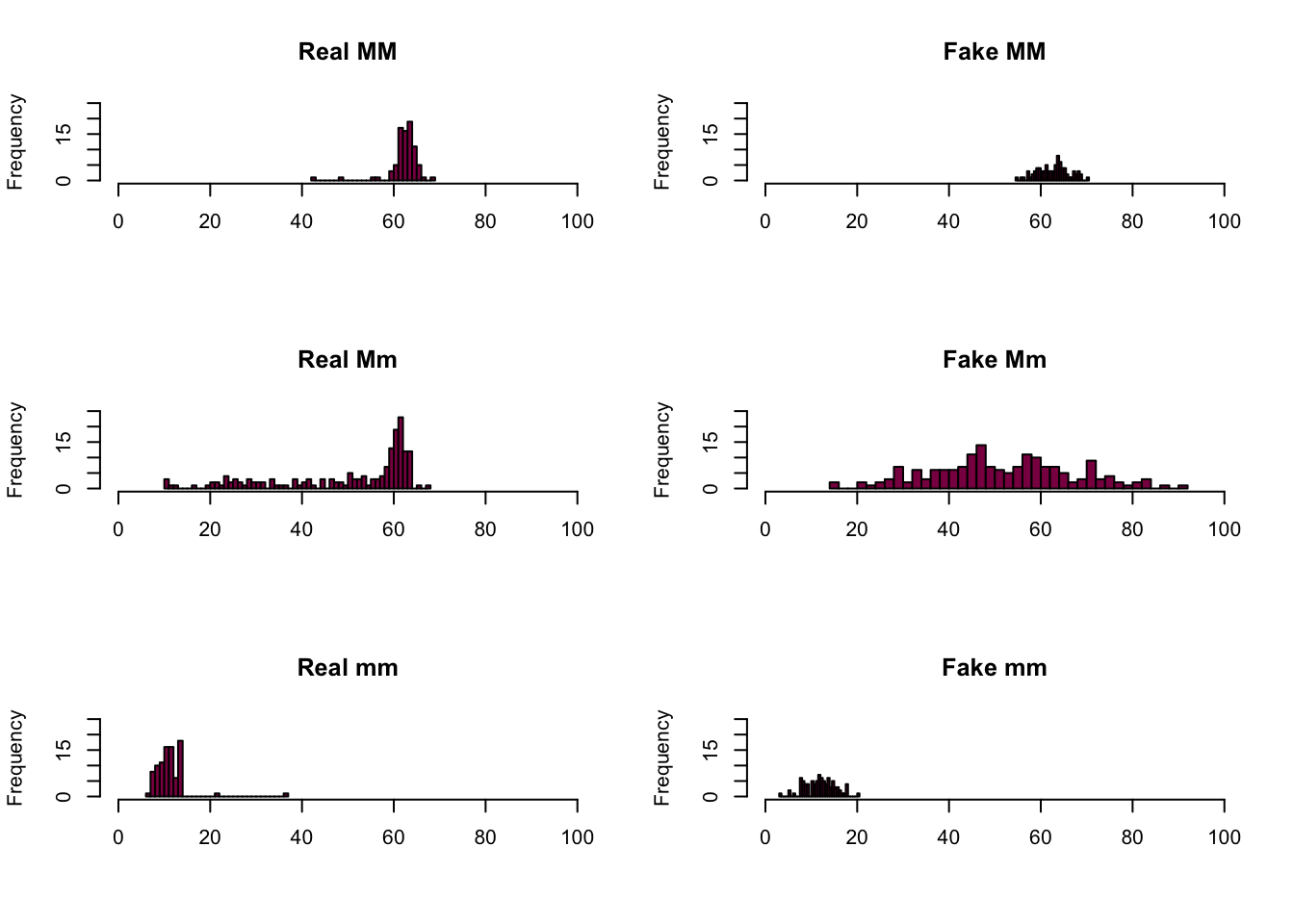
Here is the ggplot version:
plot1 <- ggplot(data = dataMM) +
  geom_histogram(aes(x = plates), binwidth = 1, fill = "deeppink4") +
  ggtitle("Real MM") +
  xlim(c(0,100)) +
  ylim(c(0,25)) +
  xlab("")

plot2 <- ggplot(data = fakeMM_df) +
  geom_histogram(aes(x = plates), binwidth = 1, fill = "deeppink4") +
  ggtitle("Fake MM") +
  xlim(c(0,100)) +
  ylim(c(0,25)) +
  xlab("")

plot3 <- ggplot(data = dataMm) +
  geom_histogram(aes(x = plates), binwidth = 1, fill = "deeppink4") +
  ggtitle("Real Mm") +
  xlim(c(0,100)) +
  ylim(c(0,25)) +
  xlab("")

plot4 <- ggplot(data = fakeMm_df) +
  geom_histogram(aes(x = plates), binwidth = 1, fill = "deeppink4") +
  ggtitle("Fake Mm") +
  xlim(c(0,100)) +
  ylim(c(0,25)) +
  xlab("")

plot5 <- ggplot(data = datamm) +
  geom_histogram(aes(x = plates), binwidth = 1, fill = "deeppink4") +
  ggtitle("Real mm") +
  xlim(c(0,100)) +
  ylim(c(0,25))

plot6 <- ggplot(data = fakemm_df) +
  geom_histogram(aes(x = plates), binwidth = 1, fill = "deeppink4") +
  ggtitle("Fake mm") +
  xlim(c(0,100)) +
  ylim(c(0,25))

plot_grid(plot1, plot2, plot3, plot4, plot5, plot6, ncol = 2)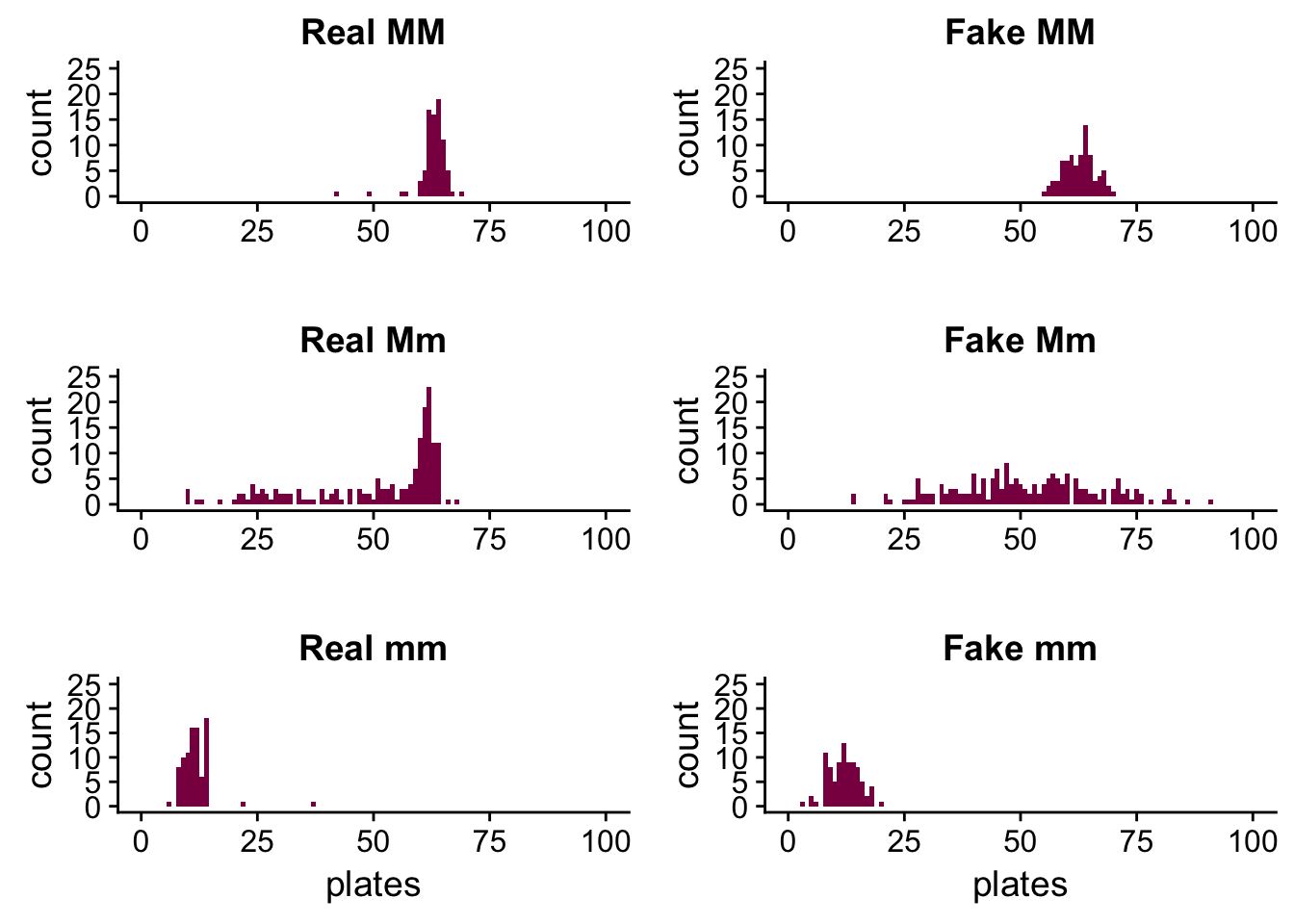
We can see that in the case of the MM and mm genotypes the fake data is a pretty good match - the reason for this is because these distributions were approximately normal to begin with, so it’s easier to simulate them by drawing observations from a normal distribution.
This is not the case with the Mm genotype - the fake sample is all over the place. It’s because the real distribution isn’t close to a normal distribution, so if we want to simulate it by drawing samples from a normal distribution, we won’t succeed. We just get something that has a similar standard deviation and mean as the original distribution (because remember, we sampled using these values), but the shape isn’t maintained.
For each genotype, use summaries of the simulated data (mean, median, variance, quantiles, min, max) and discuss whether the simulated data (assuming the normal) are looking like the real one.
summary(dataMM)## genotype plates
## mm: 0 Min. :42.00
## Mm: 0 1st Qu.:62.00
## MM:82 Median :63.00
## Mean :62.78
## 3rd Qu.:64.00
## Max. :69.00summary(fakeMM_df)## genotype plates
## Length:82 Min. :54.96
## Class :character 1st Qu.:60.24
## Mode :character Median :63.12
## Mean :62.69
## 3rd Qu.:64.66
## Max. :70.47summary(dataMm)## genotype plates
## mm: 0 Min. :10.00
## Mm:174 1st Qu.:41.00
## MM: 0 Median :59.00
## Mean :50.38
## 3rd Qu.:62.00
## Max. :68.00summary(fakeMm_df)## genotype plates
## Length:174 Min. :14.01
## Class :character 1st Qu.:41.00
## Mode :character Median :50.64
## Mean :51.54
## 3rd Qu.:61.91
## Max. :90.87summary(datamm)## genotype plates
## mm:88 Min. : 6.00
## Mm: 0 1st Qu.:10.00
## MM: 0 Median :11.00
## Mean :11.67
## 3rd Qu.:13.00
## Max. :37.00summary(fakemm_df)## genotype plates
## Length:88 Min. : 3.204
## Class :character 1st Qu.: 9.451
## Mode :character Median :11.993
## Mean :11.985
## 3rd Qu.:14.076
## Max. :20.164Is the simulated data able to reproduce sample the property of the sample:
- the mean and median ?
mean(dataMM$plates)## [1] 62.78049mean(fakeMM_df$plates)## [1] 62.69254mean(dataMm$plates)## [1] 50.37931mean(fakeMm_df$plates)## [1] 51.54418mean(datamm$plates)## [1] 11.67045mean(fakemm_df$plates)## [1] 11.98456The means match up nicely, but it’s no surprise since we specified the means when we were generating the fake samples.
median(dataMM$plates)## [1] 63median(fakeMM_df$plates)## [1] 63.1195median(dataMm$plates)## [1] 59median(fakeMm_df$plates)## [1] 50.64194median(datamm$plates)## [1] 11median(fakemm_df$plates)## [1] 11.99283The medians match for the MM and mm genotypes and differ quite a bit for the Mm genotype - this just supports what we have seen on the plots before. In the real data the median is more to the right (we have a skewed distribution there), most likely somewhere around the peak, while in the fake data it’s close to the mean and around the middle of the distribution (which is expected because in the normal distribution the mean and the median are identical, while in the real Mm data this is not the case).
- the SD ?
sd(dataMM$plates)## [1] 3.410313sd(fakeMM_df$plates)## [1] 3.35331sd(dataMm$plates)## [1] 15.14687sd(fakeMm_df$plates)## [1] 15.47118sd(datamm$plates)## [1] 3.567805sd(fakemm_df$plates)## [1] 3.228363The standard deviations match up as well because we also specified them when generating the fake samples.
- some other aspect of the data such as the more outlier points (such as the lowest value)?
min(dataMM$plates)## [1] 42min(fakeMM_df$plates)## [1] 54.95501min(dataMm$plates)## [1] 10min(fakeMm_df$plates)## [1] 14.00524min(datamm$plates)## [1] 6min(fakemm_df$plates)## [1] 3.204041max(dataMM$plates)## [1] 69max(fakeMM_df$plates)## [1] 70.47488max(dataMm$plates)## [1] 68max(fakeMm_df$plates)## [1] 90.86739max(datamm$plates)## [1] 37max(fakemm_df$plates)## [1] 20.16392If we look at the two extremes, we see that they don’t match up perfectly - but we can see these on the plots as well. This is most likely due to the random sampling process - we can’t quite expect to be as lucky as to pick the same minimum and maximum values at random as we have in the original data, especially when we are working with a relatively low sample size.
Take me back to the beginning!